Beauty & Branding: How I Build a Collection Story that Sells
Beauty & Branding: How I Build a Collection Story that Sells
I do not start with a spreadsheet. I start with a feeling. A chill in the woods. A sound of wind through branches. A spark that says, this could be a world. Then I build a path from that feeling to the cart button. That bridge between story and sale is the entire job.
This is how I took a whisper of an idea and turned it into Twilight Whispers - a witchy forest collection that people not only loved to look at, but actually bought, wore, and talked about.
Step 1 - Ask the one question
What do I want you to feel when you swatch this? If I cannot answer that, I do not move forward. For Twilight Whispers, the feeling was haunted serenity - soft menace, moonlight on moss, secrets kept by trees.
Step 2 - Build the story world
I write a tiny world bible. Two short paragraphs. Not lore for lore’s sake - a north star for every decision.
- Setting - midnight grove, low fog, glints of witchfire
- Mood - eerie calm, quietly powerful, a little dangerous
- Symbols - thorns, runes, candles, crows, the crescent moon
- Promise - wearable magic that still feels otherworldly
Step 3 - Map the color story like a playlist
I treat the palette like a song list. You need openers, chorus shades, bridges, and closers. I sketch a “flow” across 6 to 12 pans.
- Openers - approachable shimmers that hook the eye fast
- Chorus - the star multichromes that do the talking in photos
- Bridges - mattes that make the loud shades wearable
- Closers - depth builders that seal the look
In Twilight Whispers, the bridges were cool forest mattes and murky browns. The chorus was the moody shifters. Depth came from charcoal and blackened plum that pulled the eye into shadow without turning muddy.
Step 4 - Name with a system, not vibes
Names sell the world. I use a simple rule - every name must pass three checks:
- Fits the world - would a witch in this forest say this word
- Feels like the shade - say it, then swatch it, do they match
- Speaks fast - easy to remember, easy to type, distinct on a receipt
Examples I loved for this world - Nightglow for that deep blue hour, Banevine for the green that bites, Hexenmist for the veil of sparkle, Cinderbloom for ember-lit rust. Even reading them in a row feels like walking deeper into the grove.
Step 5 - Build the visual system once
I lock a small style kit before I shoot a single photo. It saves time and keeps the story tight.
- Type - Playfair for headlines, Montserrat for body
- Color accents - logo violet #8a69d4 and brand violet #6f00ff
- Props - thorns, moss, smoked glass, crescent moon shapes
- Lighting - low key, side gleam for shift capture
Real founder truths
- Pretty is not enough - the story has to guide the cart. If customers cannot imagine wearing it next week, it will sit.
- Balance the chorus - if every shade screams, nothing sings. Anchor sparkle with believable mattes.
- Photography is product - if your photos do not show the shifts, you do not have a shifter to the customer.
- Fewer pages, stronger script - tighter worlds sell better. Cut anything that argues with the theme.
Step 6 - Translate story into the sales plan
Here is how I carry the grove into the launch. Story in. Revenue out.
- Hook post - a 7 second clip of fog and a single shift pan catching light. No copy wall. One line that sets the mood.
- Proof post - macro swatch video of 2 to 3 chorus shades. Show the flip. Stackable reels for saves.
- Wearable post - eye look with 1 loud shimmer and 2 bridge mattes. Caption gives the recipe in three steps.
- Story post - carousel with the mini world bible lines. People project themselves into it. That is the buy moment.
- Email - subject sets the feeling, body shows 1 hero gif, 3 swatches, and a 3 step look guide. Link to collection.
- Live swatch - founder hands, real lighting, quick Q&A. Saves fence sitters.
Pocket checklist - build a story that sells
- One feeling locked
- Two paragraph world bible
- Playlist color map - openers, chorus, bridges, closers
- Names that pass fit, feel, and speak tests
- Tiny style kit - type, accents, props, lighting
- Launch rhythm - hook, proof, wearable, story, email, live
A quick case - why Cinderbloom worked
The base was rusty brown. The shift ran pink red to electric slime green. The name hinted ember and bloom. The story line said flame under moss. The photos leaned low light so the flip snapped. The wear post paired it with a cool matte crease. People could picture the look on their face tomorrow. That is the sale.
If you take anything from this, let it be this - story is not fluff. It is a map. Build the world first, then give people doors into it. Keep the doors clear, the names true, and the looks wearable. Magic, but make it practical.
Written by DeAndra, founder of Devinah Cosmetics
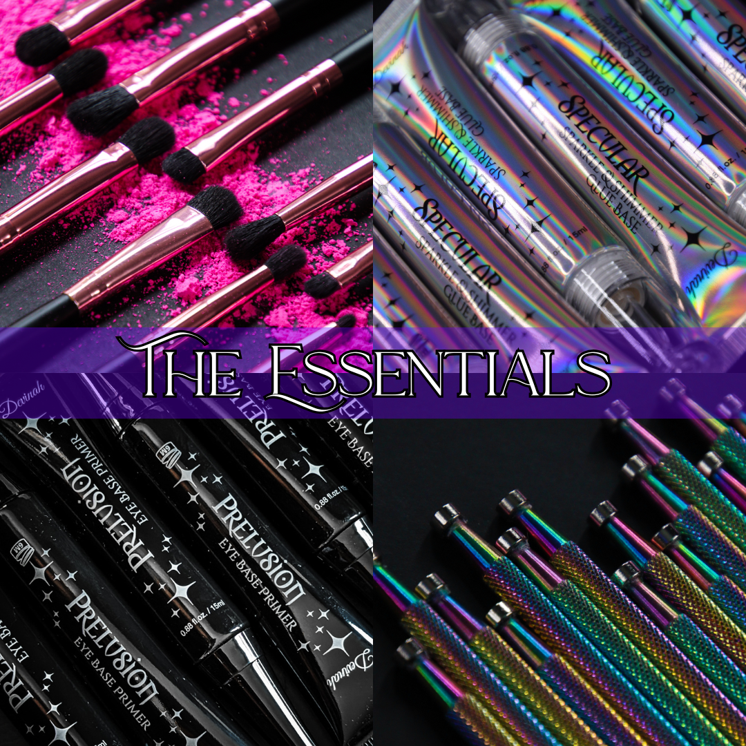
Build your own color story, one single at a time at Devinah.com
P.S. If you want me to break down the naming framework or share my full launch checklist next, tell me which one you want to snoop first.


Leave a comment